Thursday 25 April 2013

SKILLS PRACTICE - EVIDENCE OF PHOTOSHOP PRACTICE


AUDIENCE FEEDBACK COMMENTS

Jusliane Sede: ``A really good magazine cover, contents and double page spread, well done both of you`."

Imran Ali: "The image used for the contents page does not look profesional and therefore you should change the model you are using to model for your contents page and change the pose of the model to suit the R&B genre."

Maysoona Raja: "Ensure that your contents page fits in with the colour theme that you used in your front cover page and your double page spread. In addition, you need to make sure that the image used in the contents page blends in with the rest of the text as well."

Thursday 28 March 2013

 We used these images for our practise on shots to take so we know what sort of shots we was going to take later and understand the sort of shots which can be taken.


Our other images and the original

We took these images to see which is best for the contents page and chose the one of the model sitting down on the ground as this suits best for the contents page.


 This is the original image for the front cover.


This is the original image for the double page spread.


This is the original image for the contents page.

Wednesday 20 March 2013

We used these two front covers to giude us through our real magazine front cover and these two helped as we made it similary in that way.
This is our front cover.
We changed the colour of the title to white/grey to make it stand out more as the white/grey came out better than the purple and grey as they didnt make the magazine look really big but the clear light sort of grey which we used looks much better. We wrote the drug scandal with a grey and a bit of red to make it look like thats quite an important part of the magazine and the drug scandal is related to the model of our magazine `Kaydon`.
This is how we started off for the front cover.


Wednesday 27 February 2013

Thursday 7 February 2013

CHOOSING A SUITABLE MODEL    
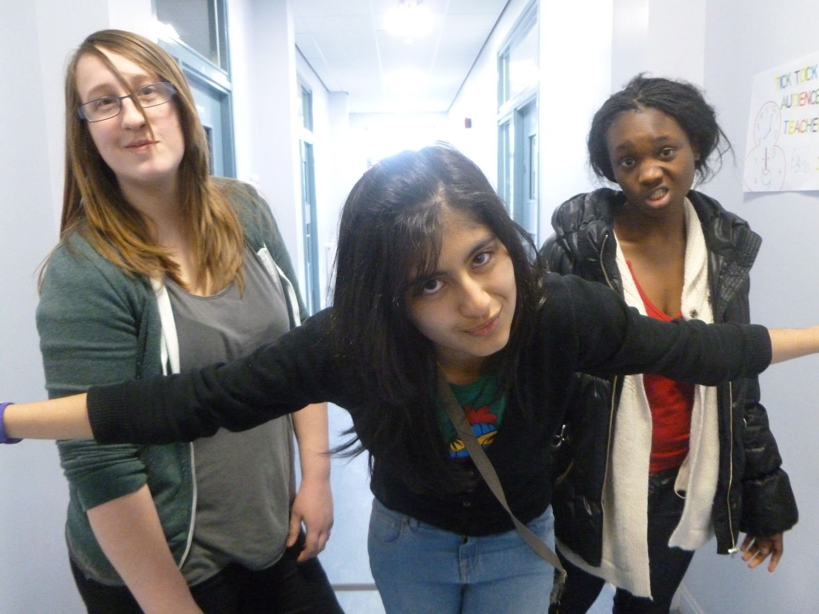
After deciding on the naem for our mast head, we started to think about the models we were going to have in our magzine to be on our front cover, contents page and on the double-paged spreads of our R&B music magazine. for our front cover page, we knew that the image of the model needed to be of a medium shot therefore we were inspired by how Chris Brown posed and was modelling on the front cover page of the magazine and we wanted our male model to pose similar to how the R&B artsist was modelling which is shown in the image of the "VIBE" music magazine below. The model that we decided to choose was a male model who is twenty and we wanted him to model i a similar way as the above artist on the frint cover page of the music magazine.

  
 As you can see, the model shown on the left hand side of the page, is an example of the actual image that will be used as the main image on the front cover of the music magazine. the fact that the image is a medium shot shows that this model will take up most of the space on the front cover page of the music magazine but the model will be wearing clothes which are not dark so that he stands out from ther background of the image which we are thinking about about taking the picture of the model in front of a brick wall so that they stand out and the focus is on them. The model will be modelling by looking directly at the camer and the audience and his hands will be in his pocket and he will be showing attitude through his casual wear whcih will have some "swag" and he will also be showing attitude through his facial expressions. In addition, his head will be slightly tilted and his cap will be loose on his head to ssymbolise how he is breaking rules the same way that R&B breaks the rules and the generic conventions of R&B music.  moreover, the head of the model will hide some of the mast head but the reader and audience will still know what type of magazine it is and the brand.
  

Wednesday 6 February 2013

PLANNING MAST HEAD

We started by doing the font for the mast head which is 'Stencil', this really stands out to R&B music as the font matches the genre. We flipped the 'R' to make it back to back with the 'B' and we enlarged these two letters to show that the genre of the music magazine is clearly 'R&B'.

Then we thought that we would change the colour of the mast head to a bright colour which could suit the R&B genre because this reminds you of clubs when there are bright disco lights and the club is black. Therefore, we chose purple but we did not make the whole text of the mast head in purple as two colours symbolise how R&B mixes with other music genres such as hip hop and rap and it symbolises the different R&B artists who sing with other music genre artists and the new artists coming into the music industry. These two colours also represent the different range of beats in the R&B music which is created by the R&B artists.  

Planning:
We first decided to choose 'Ecstasy' to be our mast head for our R&B music magazine to show how the magazine is addicting but then we thoght fully of the other connotations of the drug 'Ecstasy'. We decided that we were going to change the name for our masthead which was originally going to be 'Ecstasy'. However, we relaised that the word 'Ecstasy' had negative connotations of drugs and crime and we thought that this would attrat people to take the drug therefore our final name that we have chosen to be our masthead is 'URBAN' and the reason as to why we chose this name to be our mast head for the reason that the connotations of 'Urban' were that this word reminds you of attitudes that people have and it gives the magazine the street edge. Im addition, the other connotations of 'Urban' are that it reminds us of city life, popular dance music and there are many R&B singers who come from urban backgrounds. moreover, we decided that the 'R' in the mast head would be flipped backwards to show how R&B breaks the rules and chnages conventions of what people think of R&B music and artists therefore the 'R' and the 'B' would be back to back and these two letters symolise and identify the genre of the music magazine which is R&B.

Thursday 31 January 2013

PLANNING

In order for me to complete my music magazine for my chosen genre which is R&B, there are key elements which have to be taken into account so that the music magazine meets all of the requirements to gain full marks and these key elements which need to be planned include:
·         images - collecting existing images, anchoring, text shot, drawing ideas, thinking about the types of shots and linking the images to the article.
·         target audience - this music magazine is aimed to people aged between 13 and 25 because children who are aged 13 years old are interested in famous singers and they are influenced by these artists and they copy what they wear and how they behave and as they grow older they like to read about the artists' lives and what they get up to.
·         similar media - we have already looked at similar media by researching various R&B music magazines and analysing the cover pages, contents pages and double paged spreads.
·         house style - we ensured that the cover page, contents page and the double page spread all followed the same house style to allow them to look more professional and the house styles that we came up with
·         mast head design - the ideas that we have come up with to be our mast head for our music magazine which links  to the genre of our music magazine which is R&B and the ideas that we came up with include:
   v  Zeal
v  Ecstasy
v  Avidity
v  Ardour
v  Tremor
·  font style - the font styles that we are thinking of using are bold text which stand out in headings however the masthead of the music magazine will be bold and a different colour to the background therefor it will not blend in with the images and the text.
·  audience feedback - we made a table with the tally and we asked each member in our Media class which name they thought was best to be used as a master head for an R&B music magazine and these were the results: 
Masthead name
Tally
Zeal
1
Ecstasy
9
Avidity
3
Ardour
4
Tremor
2

·  design elements - we thought about the layout and the colours that will be used in the magazine
·  schedule - think about the dates and deadlines for the images and think about when you are going to take the photographs, where, who the model will be and also think about the costume and props that will be used and what the model will be wearing.

SCHEDULE

TASK
DEADLINE
Research and Planning
 8th February 2013
 Magazine
 22 March 2013
 Evaluation
 26 April 2013

Monday 28 January 2013

Analysing a contents page of a R&B Music Magazine
Image
The two female celebrities are both giving eye contact to the reader to engage them so that they read more inside the magazine about these two celebrities. The fact that the shadows of the two female celebrities are not clearly visible and are fading allow the magazine to look more professional and so the audience focus on the two celebrities than their surroundings. In addition, the fact the background is quite plain suggests that the page of the magazine looks more professional and so that the text stand out more clearly. The fact that the fonts of the title and the text differ and contrast from each other allow the heading and the page names to be more sophisticated.  The two female celebrities take up the most space on the contents page and they are posing seductively to attract male readers to read on about these artists and to read on about the fashion section.  The masthead is black so it is bold and also clear to show how the magazine is formal and it is also split into three rows and this is used to show the personality of the magazine. The background is simple as it is in white and grey and these colours have been used for the background to keep the contents page sophisticated and clear for the reader to see.

Layout
The layout of the contents page is that the contents page has been laid out like a trademark so the reader knows that they are reading the contents page with the word ‘CONTENTS’ at the top of the page standing out. The main image on the contents page is a long shot of two female artists and this shot that has been used is suitable for a contents page because not a lot of text should be on a contents page therefore the image takes up most of the space on the contents page and the text is on the left hand side of the contents page on the bottom left section of the contents page. The image is a large scale which suggests that an image of these two artists has been used on the front cover of the magazine. The image used is quite proactive for the reason that the two artists are wearing short dresses therefore they are revealing a lot of skin.
               
Language
There is a caption which is quite small on the bottom right hand side of the page near the image to explain what the image is to the reader and who these artists are and there is a page number so the reader can know what page they need to go on if they want to read about these artists.


Thursday 24 January 2013

Analysing double page spread 
13.5pt;">

Layout: the most space which is taken on this magazine is of the image of Wiz Khalifa and this is given so much importance as this is showing that he is the main plot of this two page spread and the magazine writers want to catch the audience’s eye as they want to show the audience that this is an R&B music magazine so they put a R&B artist to catch their eye and want to read it. This has spread to two pages as one is for the image and other is for writing which makes it balanced for the readers to read.

Image: there is only one image on the page and it is by itself on the first page separately which catches the audiences eye first which shows that he is very popular in the R&B music industry and well known which makes the audience excited as they want to read about it and if it may have any latest news about him. He is smoking which is showing a very rude image to the audience and by his face expression, it is showing he doesn't care and has an attitude problem which is showing he is representing R&B music which is quite stereotypical for R&B fans. The black background matches to his face expression as he is showing he doesn't care and is very aggressive which is shown in his expression as well as the black background. He is wearing a black and yellow cap which relates to one of his songs as he made a song which is called `Black and Yellow` and this shows us that this is what boys should be wearing who listen to R&B music as caps like these are in the latest fashion but the cap colours match to the title of the double side spread which makes it look cool and interesting. The writers make the image more clear to the audience rather than the title as this shows that the image has more importance and by the look of the image, the audience will be attracted to the image as he is a R&B artist and is well known for his songs so he gets more attention than the title as he is well known to the audience which makes it even more interesting for the readers. The image relates to the genre which is R&B music as R&B fans quite like to be in the modern world and are mostly stereotyped to be rude and aggressive but a bad person but this is just a stereotype but they are also come across as thugs which is makes it clear in this image as he is smoking which is bad for your health but making an expression that he doesn't care shows the audience that this is how R&B fans are in personality wise and this is stereotypical.

Language: there is some sort of rhetorical question used which says `How High? ` and this makes the audience think about what the question is asking for and this also shows the readers that this question could be linked to Wiz Khalifa as he is smoking and could say that he high over with too much smoking and this then reflects back in to making the reader read the magazine article. This sort of question makes the audience want to read this and be interested as the way the question is used makes them think so much and want know what is the question trying to say. This isn't very formal language as it is quite straight forward and simple to the point. The two words how high tell us that this is linked to the title and cap as the question is in black and same font which makes it seem very similar and cool.

Genre: the genre is quite straight forward that it is R&B music as the way the magazine is presented is in an attitude and cool way where they are in the modern world with the latest fashion for teenagers and the way the image which is shown on the two side spread is one of the artists. The artist Wiz Khalifa is shown to be with lots of attitude, rude, aggressive and bad as a role model as he is shown to be a `Thug`. 
Planning
Target audience: the target audience for my magazine is teenagers and adults who are aged about 13-25. The gender is female and male as this is aimed to both genders. The target audience which is aimed at is that they are the ones who like R&B music as my magazine I am doing is R&B. The clothes my target audience must wear is the latest trendy clothes which are the clothes which are expensive, stylish and cool as there is image of them is that they have attitude and are into R&B music and they like the modern trends but also are they like to keep on date with the latest clothes and fashion which is out now. They must like listening to Drake, Niki Minaj, Rihanna, Beyonce and much more R&B artists. They must have interest in dancing as when they watch Beyonce and her music and looking at the latest fashions of clothes and wearing gold and getting the cool trainers. There behaviour is must be very friendly as they talk a lot as they are bubbly, up to date with the latest and want to know what the latest songs which have released from their favourite artists. The way they must act is they are down to earth but like to relax at times and just go into their music world and have many favourite artists and who listen to R&B music everyday.
The magazine title I am thinking can be:
-Jacked- when taking all the R&B music and listening to it alone and being able to do what you want as the R&B music is with you now.
-Step up- when you step up in music and should dance away by the sound of R&B music.
-Not Kidding- R&B isn’t a joke and it is serious music where people enjoy and make them sound as this sound as if they are being realistic.
-Dream-this is where that R&B music is some sort of dream throughout your whole life and achieving your dream by keep on listening to R&B music forever.
-Right now-This is saying that the music R&B is started and already around and its saying that R&B is some sort of journey of life.
-Jump- this is saying jump meaning jump into the R&B world as this will be a big jump for you as everything is there with you with just one big jump.
Content:  there will be interview of one of the artists and also reviews of the new artist’s songs which will make the audience who is teenagers want to read about this and find this magazine. There will also be ratings as stars for songs as there will stars and most meaning best can be 5 stars. This will persuade the audience into reading the magazine as they will find the stars bit interesting and want to know which song is a hit and what most people like as then they will want to listen to the music that other people find good. There can also be things latest about fashion in R&B music as this makes the whole of boys and girls audience into reading this as they want to know the latest fashion for R&B music and what type of clothes do their favourite artists wear as this will make them wear similar and also about if anything else that has become fashion and this can be wearing chains or having your ear pierced for boys but for girls, there may be dresses that are gold and flashy earrings. There can also be
Analysing Two page spread

Layout: the most space which is taken is of the image of Florence Welch. This is given importance as the written content text is written about Florence Welch and this has information about her so a large image of her is used to fill in most of the space to attract the audience into reading this as this makes the audience want to read it as she is well known and people would like to know when they see her as she is has taken up to half the space on the double page spread. This attracts the audience as it is very big and catches their eye to want to read about her.
Image: there is only one image on the page which is of Florence Welch as this is a very large image. This image relates to the written content as the text written is about Florence and her latest news and her stories which make it interesting for the reader as they know Florence for her music. The image is framed around Florence sitting on some sort of table with a sheet on top which is coloured red and white matching Florence. She is wearing a black short dress suit that with black high heels and she has one leg on the half the table and one on the floor as she is posing towards the audience. She has bright tangy orange hair with light orange lipstick and black eyeliner on her eyes; she also is wearing black nail varnish. The props that are being used are the stool table with a big sheet cloth to cover the table so it doesn’t exactly show what is under the sheet. All this make up and clothes show us the fashion of R&B music as they wear trendy fashionable clothing and the colour black shows the audience attitude of R&B singers as they are showing R&B music is very important and by the clothes he is wearing, she represents R&B music. The colours mainly have been used are Red, black and white as this shows its sort of a happy mood and its making the audience feel there is something mysterious about the two page spread and these colours represent a happy mood. The image relates to the target audience as the image is for R&B music and R&B have all sorts of fashion and love to be stylish and Florence is showing that.
Language: the language which is being used is a rhetorical question as to make the audience think but this is a question which cannot be answered as it is rhetorical. They try and make it interesting by using the question as this makes the audience not just think but also want to read more of the magazine as this makes them interested. The language is not formal but its a little `slang` used as when they are writing a quick start heading which makes the audience want to read it. The language which is used is straight forward but is a little confusing as it makes us think that what is happening with one of the artists. The language which is used is very detailed and quite entertaining. This makes the R&B music magazine look even better as the text is interesting and stands out to the audience. The language gets the audience’s attention as it isn’t boring and too formal as then the audience would be too bored and wouldn’t like to read on.
Genre: the genre is R&B music as Florence Welch sings R&B songs which show she is representing R&B music. She is wearing the latest and fashionable clothes which make the audience think that this is what the latest artists which are women are starting to wear. The audience recognise it is R&B music magazine as by her clothing and her face expression as she is showing attitude in which R&B artists show a lot of attitude when it comes to music and she is well known so all her fans must know it’s an R&B magazine.

Monday 21 January 2013


Analysing double page


Layout: the most space which is taken is the text and the image which takes a large amount of space. From the double sided page, there are images across the pages.  The images are given importance as they are represented to show the R&B magazine and each of the small images placed across the two pages are showing different sort of poses of Solagne Knowles who is Beyonces sister who has released so many albums in a year and represents R&B music so much. The magazine makes the audience think that this is a very fashionable magazine that brings different sort of style in R&B music and makes them think this is a trendy and popular which makes them want to read it as the writer makes it look interesting.

Image: there are many images on the page, there is one image in particular which is big and is the one who has colour. This relates to the written content as the image is of Solagne Knowles who is Beyonces sister and the two side written contents talks about her albums she has made in one year for R&B music and this shows her success. The big image of Solagne Knowles is framed on the second page which is enlarged and is quite big and covers half of the second page. This has an effect as it shows that she is related to what they written contents says which makes the audience want to read the written content after seeing the image of Solagne Knowles. She is wearing a red dress with a blue mini waist jacket which stands out as these are the only colours that are bright and the rest is quite dull and doesn't make it seem as if it is important. She is wearing purple high heels with the clothes and this represents that she is being fashionable and trendy with the clothing she has on. The images which are across the two sided pages are of Solagne Knowles who is modelling and doing different sort of poses which suggests that she is a fashionable person and this also makes it look creative as there is one image from all that is standing out and the rest are just set as background which stand  out. The image relates to the target audience as this is aimed at teenagers who are the main target audience who listen to R&B music most of the time and enjoy their life listening to music of R&B and reading these sorts of magazines. The magazine shows us that this is aimed at teenagers as young female teenage girl’s love fashion and latest expensive clothing and this image shows us that Solagne Knowles is very fashionable and makes them want to read this magazine.

Language: there is lots of use of language where the writer has written ‘’forget her sister. The outspoken Solagne Knowles created one of the year’s best R&B albums`` which is a sub heading before writing about it. This has an effect as it shows that the writers tells an overview of what the content text says about Solagne Knowles and this makes the readers want to read this content text as it tells the audience she has released one of the best R&B albums which makes them feel interested about this and read more about it. The way the sub heading has been written isn't formal as the language used is quite slang as it gets straight to the point by saying writing the content text in a ‘slang’ sort of way which is writing opposite to formal. The text links to the images as the sub heading talks about Solagne Knowles who is the main image of the two pages. The type of face which has been used is of the Solagne Knowles who is posing and making a straight face to the audience which makes her look innocent and fashionable. This gets the audience attention as she straight looking at the audience and showing she is an important person.

Genre: the genre of the magazine is shown through the images as it shows this is a fashionable, stylist and trendy magazine which represents R&B music doesn't just show music but also has fashion involved and has a variety of things involved.


Saturday 19 January 2013

Analysing contents page

Image: there is only one image of Kayne who is a singer and the image is grey and quite dull and is representing R&B as it is quite mysterious and is showing fear as there is a hand on Kayne with a heart and the audience’s eye is drawn to the point of the hand as
the only colour which is red is the heart which attracts the audience thinking that is an important part of the image. This shows love and shows that he may have a love life and it shows the main thing about the image. The image is placed on the left hand side where there is information about the contents on the right hand side which is showing the image is much bigger and more important on the contents page. This is a medium shot and the colour of this image is greyscale showing that this is a very mysterious image. The image of Kayne’s face expression is dull and showing attitude as he is making a straight face with his hands in his pockets showing he is representing R&B music. The clothes which Kayne is wearing is quite classy and trendy as they are worn in the modern days and this also shows that this magazine isn't all about R&B music but is expresses all sorts of things which could be fashion, art and celebrities which shows that R&B music is creative as it involves all sorts of things.

Language: there is use of language on the contents page as at the top, there is one word saying contents which is black and stands out as it is bold and flashes out to the audience. The word is spread down the page which makes the audience read it slowly and know what it is exactly. This shows the style of the magazine showing it is a cool magazine which allows you to take your time and read and this relates to R&B music as it is laid out and relaxes you. The information on the contents page on the right hand side is very simple and straight forward and shows that this is clear and is isn't scrambled and makes it easier for the audience to read it.

Layout: the background is very dull and greyscale as it is plain and doesn't really have anything interesting but all the focus is on the image as that makes it interesting making all the audience look at the image of Kayne. The background does have `V` which shows this is a Vibe magazine straight away as it is representing R&B music and this is a much darker grey which has been used for the `V` but is still makes the background look good. The layout of the contents page is straight forward and very simple as it gives out the information straight and it is quite clear. The contents page information is laid out simply just to show the audience what is in the magazine as this makes it easier for the readers to know what is in the magazine. The whole page shows us that straight away the image of Kayne who everyone who listens to R&B music will know straight who this singer is as he is representing R&B music and this makes them want to read the magazine more as they know him and there might be information about him and his new songs, albums or about what he is planning on doing which gets the audience excited. The relationship between the audience and this contents page shows that it is good as the audience may like the singer Kayne and want to read the magazine and the magazine is showing the magazine contents pages stands out and is very modern as so is R&B music.

Genre: the genre of this magazine contents page is R&B music and shows a singer who sings R&B music and stands out from the whole contents page. The genre of the page is dull and plain and is focusing on the singer who sings for R&B music. The focus is the image but the genre definitely represents R&B music as it is showing attitude and the whole page shows that music is sort of another world which shows R&B is very important and makes the audience want to know more about it as the page makes it look hidden and mysterious and audience love mysteries and want to know what it is so the colours really show what genre the contents page is. The colour which is used is grey but there is only one other colour used which is red and that is the only focus of the image as it is only colour that is red showing a heart showing the part of Kayne’s love life.

Thursday 17 January 2013

Analysing ‘VIBE’ magazine

 
Image:
The only image on the front cover page is a medium shot of the singer Chris Brown and this image relates to the written content because there is a rhetorical question on the left hand side of Chris Brown which asks the reader ‘IS THAT CHRIS BROWN?’ and the question is asking about the singer who is on the front cover page of the magazine. The image of the R&B singer is framed in the centre of the magazine cover page and because it is the centre image of the magazine cover page, it suggests that the main story inside the magazine will be about the singer who is on the magazine cover page so the image is clear so the reader will expect to read about Chris Brown inside. In addition, because the image is clear and stands out from the text, it shows that this singer is very popular and his image is noticeable so the audience will be able to realise this. The clothes that the singer is wearing are casual and the singer has style which suits the target audience because the readers who would read this magazine are teenagers and middle-aged people who are both men and women and they would dress casually with style like the singer in the image. The colours used on the magazine cover page of ‘VIBE’ because the text around the image is in white which is bright and the title ‘VIBE’ is also in white which indicates the main subject in the magazine will be about ‘VIBE’. The white text contrasts with the other text which is in green and red which do not stand out as much as the white text and the fact that the background is not bright means that the white text stands out more and is more visible and clear to the reader.


Layout:
The image of the singer ‘Chris Brown’ takes up most of the space on the cover page of the magazine which indicates the importance of this singer and informs the reader that there will be many topics discussed about this singer inside the magazine. The fact that the image of the R&B singer is in the centre of the magazine cover page and the title is at the top of the magazine cover page and is sort of covered up suggests that this magazine is very popular and well-known therefore the reader does not need to see the title of the magazine because they already know. The fact that the other topics discussed in the magazine are on the right hand side of the cover page of the magazine shows that the magazine has a variety of different topics listed down on the side of the magazine to show how much the magazine is packed with various discussion points and topics, news and gossip about different R&B singers and other famous people. The range of topics discussed and news in the magazine appeal to a wider range of audience. The fact that the background behind the singer is not on stage but is of a rural setting suggests that this singer is not performing but is being himself therefore this informs the audience that the topics inside the magazine will be looking into the life of this R&B singer. The magazine has put what they offer in a red circle to create a bigger emphasis on the fact they are the ones with the exclusive look into these subjects

Language:
The magazine has used a range of words that stand out to advertise the magazine to show the audience that this magazine offers more interesting news, gossip and discussion points than other magazines. They have done this by using words such as ‘mega’ and ‘hottest’ to show that the ‘VIBE’ magazine is the only magazine that includes these features that other magazines such as ‘don&apost’. Moreover, by using a quote from ‘Chris Brown’ ‘I’m still a virgin in your eyes’ connects to the reader by including them within the magazine which creates a huge effect on how  the magazine is going to affects the audience.